
Best Email Marketing Campaigns
As marketers, we need a daily dose of inspiration to deliver value to our customers and get the ROI on email marketing efforts for our business. And whether you are just starting your marketing journey or are a pro-marketer, we also need to keep ourselves updated with what kind of campaigns are working these days so we can take some of the best practices from them for our campaigns.
But it's hard to find emails when you are looking for them! That's why we have compiled a list of 20 email campaigns of different types and from a variety of industries. These are handpicked from our own inboxes so you can be sure that these follow the latest design trends and best practices.
We have chosen campaigns from different industries - subscription apps, Saas business, direct-to-consumer brands, etc. The emails are of different kinds such as launch emails, offer emails, emails asking for feedback, or register for the event.
We have decided to focus on the intent of the email and how well that is conveyed, imagery, design, brand alignment, and the copy used to persuade the reader to take action.
20 email marketing campaigns that you can learn from
Table of Contents
Evernote offer email
This email from Evernote was received 3 days after they introduced the 40% discount offer for new users. Such emails are usually part of the onboarding sequence. If the free users don't convert to paid users during the onboarding or at the end of free trial, then such emails can be sent to incentivise them.

Why it's a good campaign:
- Highlights urgency by saying 'Last chance'
- 40% off offer highlighted by a bright graphic so it's hard to miss it
- Reiterating the benefits which they already mentioned in onboarding email
- Offer expiry date gives a clear timeline for people to make a decision
- Repeating CTAs for better conversion
- It's well branded with the green color -- the brand color of Evernote
- Footer includes the nitty-gritty details about the offer
Airbnb welcome email
This email was sent by Airbnb immediately after we signed up on the platform. It assumes that the person signing up can be either a traveler looking for their stay or can be a host looking to open their home for guests.
It's a very warm email. Let's see what makes it so good:
- Gives a sense of belonging by saying that 'You're now part of a community...'
- Clear value prop with three short and simple lines - 'Find a place to stay. Discover things to do. Or share your home.'
- Images are pleasant and create a sense of safety as well as adventure
- CTA doesn't push you to book a home or go find guests. They simply ask you to 'Explore' or 'Learn More'. Non-pushy way makes the reader feel at ease that they have scope to find out more before making any decision.
- They included a note about the Covid-19 to make it relevant for the current times and handling any objections.
- Footer is extremely clean with only the necessary information
- Each section follows a pattern of - Headline, subheading, images and CTA.
- Copy is short and to the point. Easy to skim through.

Birchbox offer email
Birchbox is a company offering subscriptions on personal care, beauty and grooming products. It's a DTC brand so tends to send a lot of emails to stay on top of people's minds & keep them informed about new offers and product launches.
This email was sent to convince subscribers to opt for 12-months subscription. If people sign up for a year-long subscription, that's really (really) good for their MRR -- the holy number for investors & founders.
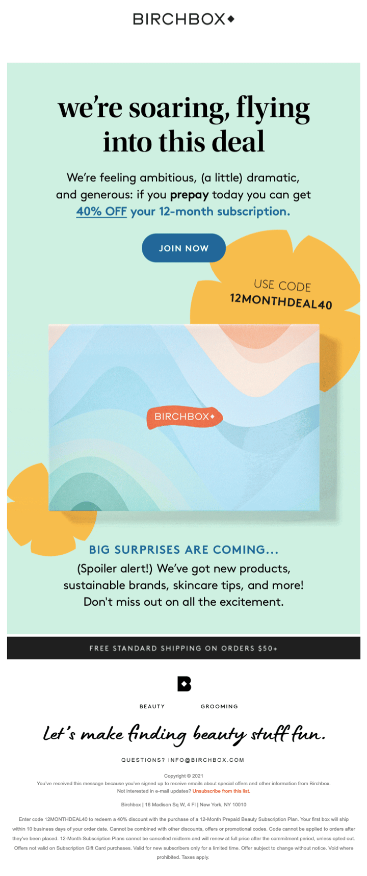
Don't know how much money it made them but it sure offers a great deal. Let's break it down and see what you can take away:
- Headline builds up the hype and makes you curious about this 'deal'
- Offer is clearly explained with how you get it -- by prepaying & with 12-month subscription, what's the discount -- 40%,
- Offer is immediately followed up by the CTA. CTA doesn't use sales-y words like 'Buy Now' or 'Shop'. It's more of an invitation as it says 'Join Now'
- The code on the side of the image shows how to avail the offer
- Keeps an open loop with 'Big Surprises Are coming.' So even if you don't avail this offer, you will look forward to their next emails
- Free shipping note at the end caters to price-sensitive customers who are not ready to pay for shipping yet
- Footer includes their slogan which keeps things upbeat
Codecademy feedback email
Codecademy is an online interactive platform to learn coding. They offer a free trial for 7 days before nudging you to get a paid plan. This email was sent after we ended the free trial and didn't sign up for the paid plan.
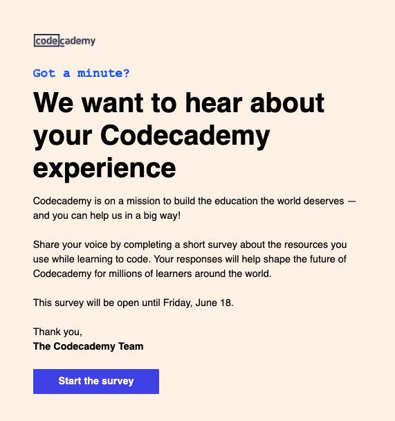
What's good about this campaign:
- 'Got a minute' on top sets the expectation that it won't take more than a minute to go through this message
- The bold headline says exactly what's the purpose of this email. It's written in simple english and just like how you would talk to someone in real-life
- Since it's feedback and there is nothing much for the subscriber here, they give a reason on why you should share your feedback. They have associated themselves with a mission. People are generally excited to be part of something for the greater good. So this mission statement serves that purpose
- There's a clear deadline to the survey so people don't put it off to be done later
- Clear CTA that nudges you to just start the survey and not worry about completing it
Fully social proof email
Fully is an ecommerce furniture brand. This email was sent as a part of their campaign to launch a new set of products after work from home became common.
This email was sent much later in the campaign since it's a social proof email. A good word from others like you gives you confidence in the brand. It's a psychological cue to the brain to trust the brand since our peers are recommending it.

Not many brands do social proof well in emails. Let's see what you can takeaway from this email:
- '.. People love us' mentioned at the top immediately primes our mind to think positively about these products.
- The visuals of 5 stars makes the product slightly desirable
- There is a balance of reviews from common folks who would have used their products and famous publications like Business Insider. This builds credibility
- Clear product images in suitable environments help people visualise how it will look for them if they bought this product
- Reviews that are selected are not vague. They provide insights into what's good about the product and how it is helping make people's lives better
- The CTA at the end invites you to explore the brand and pick your own products
- Footer has social media links for further engagement with the brand. There's also a support line to clarify any questions.
Harry's holiday newsletter
Harry's is a DTC brand that manufactures and sells shaving supplies and men's personal care products. This email was sent a few days before Christmas & taps on the fact that people need to buy gifts for others during the holidays.
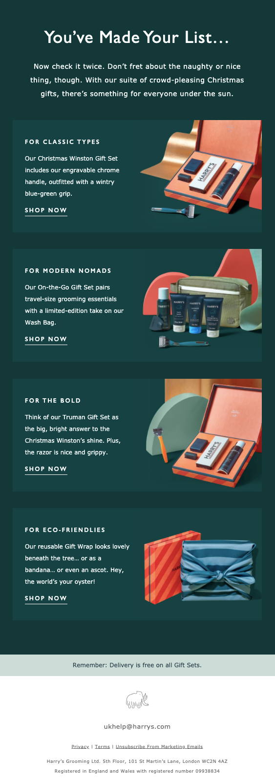
Holiday emails like this are a great idea, especially if you are a DTC brand. I wonder if any Saas company promotes itself as a gifting option during the festivals ;) Do you know any?
While we find that out, let's see what's great about this email:
- The sub-heading positions these as 'crowd-pleasing Christmas gifts'. This way people make a mental note to pay attention to this email if they need to buy gifts for the holidays
- Image of the gift set helps people checkout the product right there in the email without visiting the website or the store
- Each description tells out what's inside the gift set. Headline of each section talks about the personality this gift will suit
- Note at the end about free delivery clears any questions about shipping charges of extra fee during holidays
- The dark background color compliments the bright color of the gift sets
- The footer includes their classic elephant logo & email address to write to for any further help. It's clean and clear
Buffer new integration email
Buffer is a social media management startup. They help you schedule, analyse and manage the posts that go on Instagram, Twitter or LinkedIn.
This email was sent recently when they launched the integration with a tool for creating graphics -- Canva. Earlier, people would have to create social media posts in Canva, download it and then upload to Buffer. But with this integration, they wanted to inform everyone how easy it would be to create & publish content now.

Let's see what's so cool about this campaign:
- The headline gives a hit of the integration and creates some space for curiosity
- Use of emojis make it friendly and gives a playful tone
- Sign off has an image of an actual person which helps build connection with the brand. Ultimately, humans buy from other humans
- Image shows how the functionality looks
- 3 clear reasons why someone should care about this new integration
- It informs that every plan - free or paid will get this integration so that everyone can try it
- Used a combination of hyperlinks and button CTAs
- PS at the end works like a wink at the end of a chat ;) It's an opportunity for asking a favor, informing something related but not directly. They have used the PS to encourage people to create buzz on social media.
Masterclass new class introduction
Masterclass is an online, subscription based education platform where you will find pre-recorded classes by experts in different fields.
This email was sent when they recently launched a new class around career paths with the famous personality, Elaine Welteroth.
What makes this email worth keeping in your swipe file?
- They are aware that here the person teaching the class will get more attention than the topic itself. That's why they are leading with introducing Elaine Welteroth rather than the actual class topic.
- There is one main CTA 'Subscribe Now' and that is repeated after every pitch/section. This maximises the conversion per email
- The footer has links to download the app since daily active users would be a key metric for them
- Alternating colors between different sections to make the email easy to consume
- Section pitching other classes incase the subscriber is not interested in the new class
- The value prop at the end Learn from the world's best chefs, negotiators, musicians, writers and more is easy to understand as it uses simple words to convey the message
- The images are professionally shot so the subscriber can imagine the high production quality of the classes

Plum event email
Plum provides group health insurance to companies for their employees.
This email was sent as a part of free events they do around health and fitness to stay on top of people's minds, build their audience and become a brand that's liked by people for the value they provide. Otherwise, insurance can become a pretty boring topic.
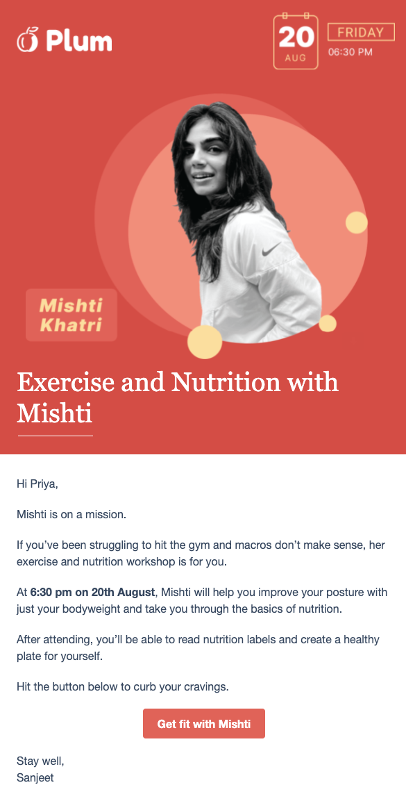
It's a good event invite email because:
- The image clearly shows the date & time on top
- Even topic and host information is also clear on the poster
- The email copy starts with addressing the problem before suggesting why you should attend this event
- Tells what you can get out of attending this event - good posture, and knowledge to read food labels
- Conversational CTA
- Sign-off is not generic but brand and messaging aligned
- The email is short and sweet that you can read in less than a minute to decide your next action, whether to attend the event or not
- The colors are brand aligned and tone of voice is friendly
Teabox Abandoned cart email
Teabox is a company making and selling teas. This is an email I got after I added a few items to my cart but then had second thoughts about whether I need those teas or not and didn't complete the purchase. It was sent 1 day after abandoning the cart.

What makes it effective
- Incentivising to complete the purchase by making a 'free shipping' offer
- Details of items in the cart and quantity of each item
- Repeating CTA with same purpose but different wordings to increase conversion
- Embedded a video of a popular American show to signal credibility
- 'Why Choose Us' section convinces people who are on the edge
As a result of this email, I am currently sipping their Kashmiri Rose tea and writing this article. It worked on a marketer to make a sale, so it's worth keeping in your swipe file.
Grammarly re-engagement email
Grammarly is a software that reviews your writing for spelling, grammar, tone and clarity. This email was sent after I didn't use Grammarly for more than a week.

Here's what you can learn from this email:
- It asks you to check if you are logged in so that you can be sure that your writing is being checked by Grammarly. Clear CTA after that
- Main CTA is above the fold in this email
- Show you number of words checked which tells you that Grammarly is super useful for your work
- Content to educate you on writing. This builds trust with the brand
- CTA to checkout premium, which is Grammarly's paid version
- To remove any friction, CTA to reset the password
Headspace onboarding email
Headspace is a popular meditation and sleep app. This email was part of the onboarding sequence I got after signing up for their paid version.
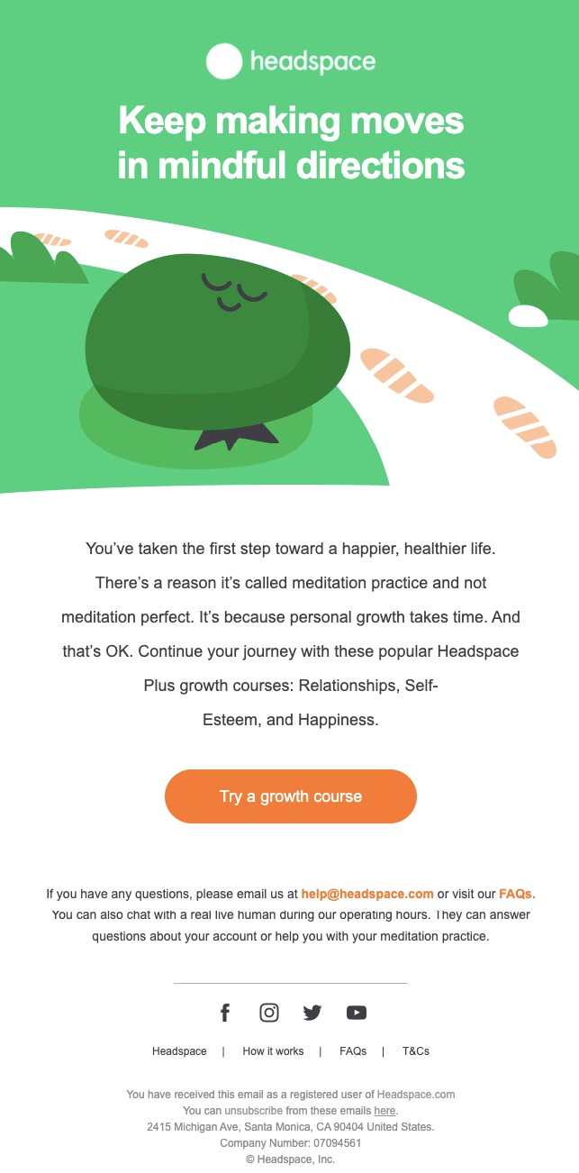
Here's what I liked about this campaign:
- Uses positive reinforcement & encourages the reader to keep going on their mindfulness journey with the headline.
- The image is brand aligned. All their illustrations follow the same pattern
- Gives suggestions for growth courses so you don't get confused with the whole collection on the app
- CTA just asks you to 'Try' the growth course which makes it non-pushy
- The aim of the email is to help you build a habit so you stick to the app for longer
- Footer has the necessary information to contact support incase of any issues.
Hubspot webinar email
Hubspot is a marketing, sales, and customer service platform used by mid-size and enterprise companies to scale and grow their business.
This email is part of their regular marketing emails sent to people in their broadcast list. It is informing people to sign up for an upcoming webinar before they close registrations.
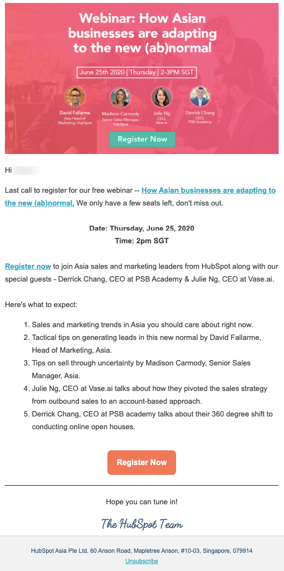
Let's see what makes it effective to announce the last call for a webinar:
- The header gives the basic details about the topic of the webinar, timing, who are the guests. There is a CTA right in the header for people who are convinced and don't want to know anymore to register.
- In the main copy, it creates urgency in two ways: a) By saying that it's the last time they are reminding you b) There are limited spots left
- Clear bullets on why someone should attend this webinar
- They mention names of guests whom people would be excited to listen to.
- A subtle hope you can tune in message at the end adds a human touch to the invitation
Mindvalley re-engagement email
Mindvalley is an online personal development learning platform that provides courses from experts in different areas to help you optimise your life.
This email was sent after I had stopped opening their emails for about 3months.
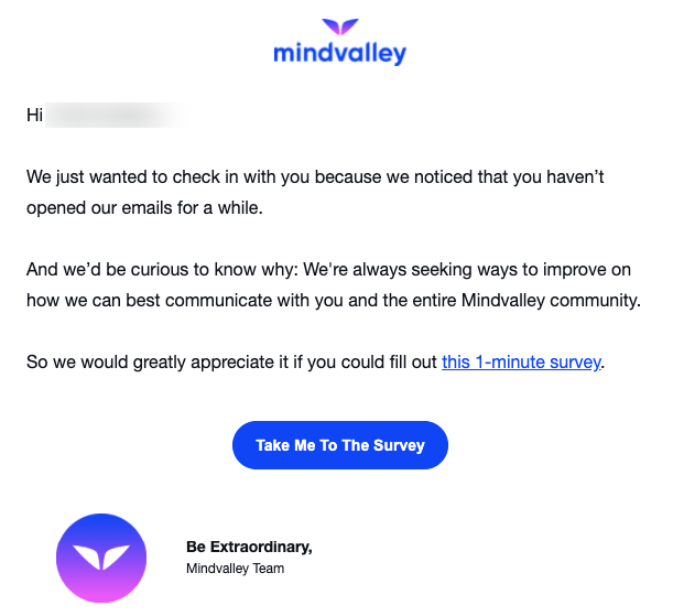
You should consider sending such an email to your inactive audience too. Let's take some ideas from this email:
- Mention a reason for sending this email -- 'because we noticed you haven't opened our emails..'
- Tells you why they are curious to know more. It's because they want to find the best ways to serve you and others like you
- A simple ask to fill a survey
- Clearly mentions the time it will take you to fill the survey so that expectation is set
- Conversational CTA
- Sign-off is aligned with their slogan 'Be Extraordinary'
Peloton objection handling email
Peloton is an exercise equipment and media company. A Peloton bike can set you back by $2-3K. It's a significant investment for an exercise bike. Since the price point is definitely an objection in people's minds, they ran this campaign to inform people about financing options & monthly payment plans.
Here are some learning points to note from this email:
- The image helps people visualise the bike in their homes and reinforce it's requirement
- The headline puts the reader at ease by highlighting that there is a way Peloton can fit into their lives
- Monthly payment is compared with the price of taking a family for the movies. This shows that it's worth investing that much for your fitness
- How to avail financing is explained clearly in 3 easy steps. Even time to fill the application is clearly mentioned
- Link to content showing if Peloton is worth buying to convince people who are still on the edge and need more information before making a purchase
- Link to download the app in the footer section

Sleepy Owl back-in-stock email
Sleepy Owl is an Indian brand selling coffee and coffee wares. Their coffee helps me kick start the day and bring you amazing content. Hope you are enjoying it ;)
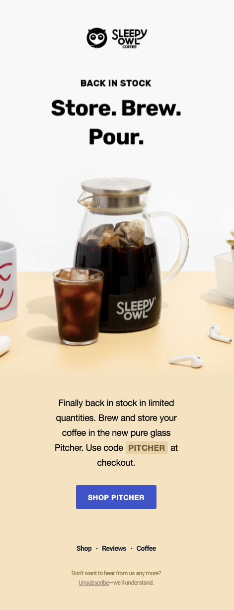
This email was sent to inform subscribers that they have re-stocked some of the items that were not available for a short while.
Let me pour a cup of cold brew before I tell you what's great about this email
After a cold coffee break
Here are the takeaways:
- Clear product image grabs attention and if this is something you have been eyeing to buy for a while, it will have your required attention
- Back in stock label on top signals that it's a popular item and tends to go out of stock
- 'In limited quantities' creates urgency for people who want to buy this but are not taking the action yet
- Gives a code as an incentive to checkout
- Clear CTA with the product name -- Shop Pitcher
- Minimal, to-the-point copy
- Focus is only one product at a time. Doesn't overwhelm you with their whole shop
- Footer is extremely simple, giving you link to three main pages on their website and unsubscribe link
Wistia Welcome email
Wistia is a video software company that helps you to host videos, publish them and track performance. This is the email you get when you sign up on their platform for a free account.
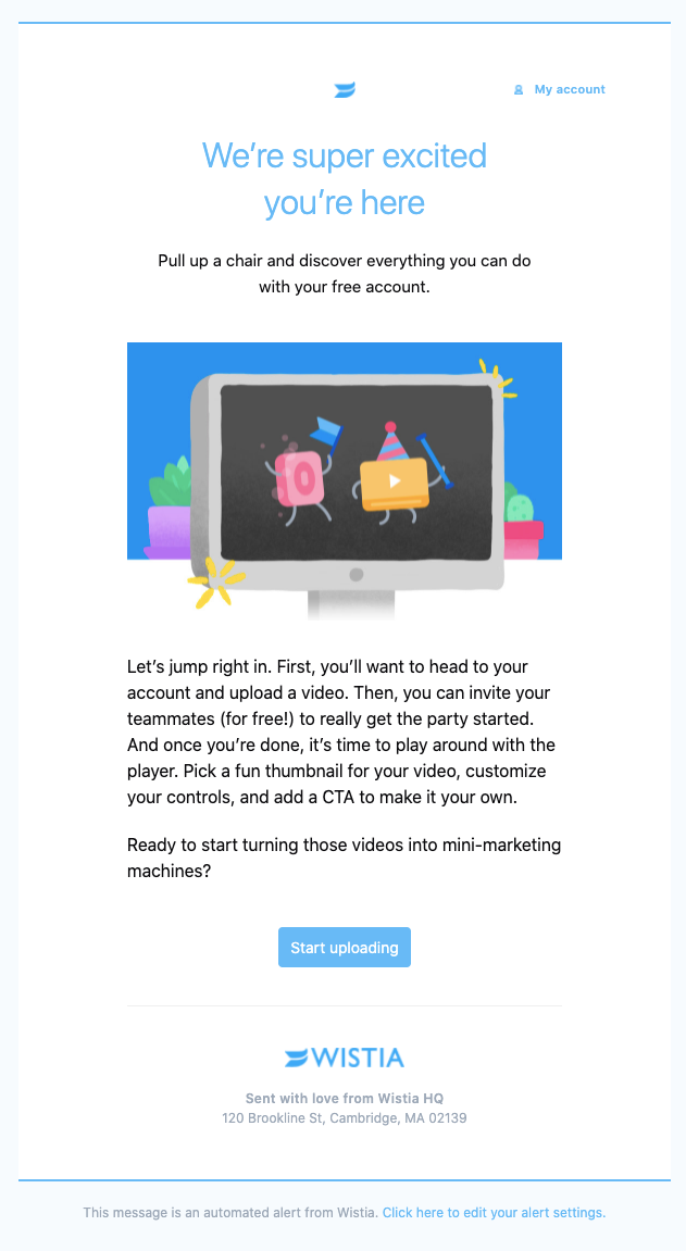
Here's what you can learn from this:
- The headline is a warm welcome
- Phrases like 'pull up a chair...' gives a signal for the brain to stop and pay some attention to it
- It gives you clear, simple instructions on what to do next
- The idea of turning videos into mini-marketing machines is exciting and shows the benefit of why one should be using Wistia
- CTA is super specific with what step you have to take next
- Footer is clean with only the necessary information
- The email is overall, very brand aligned in terms of colors, illustrations and tone of voice
Typeform new product launch email
Typeform is a software that allows you to collect reviews, conduct surveys via text-based forms.
But someone must have thought - why can't we do all that & more, but with videos? And hence, their new app called Videoask was created. This email announces that app.

Here's what I liked about this:
- 'A new way..' sounds exciting as we all want to know what's next, what's new and not miss out on anything
- The images give a glimpse of the app, building up tension before announcing what's new
- Headline tells what Videoask is and then leads with the benefit -- '..helps your business have more meaningful interactions'
- Shows you various ways to use Videoask to increase adoption
- Presents a case study of someone getting results by using this new app & quantifies the results
- Closes with some features and re-iterating the benefits
- CTA informs that it's free to try, reducing any barrier for people who might think they need to buy another license for it, or it will be expensive
YETI new product launch email
In the previous example, we saw a product launch from a SaaS company, now let's see what would a DTC brand do to launch their product?
YETI is an American company making outdoor gears. They make stainless-steel drinkware, soft coolers, ice-chests and related things.
This email was sent when they updated the cap of one of their bottles to make it leak-proof. It might seem like a product improvement but these are the features and details that their outdoor-loving audience really cares about.

Let's unlock what's great about this campaign:
- Image portrays an adventurous persona on his kayak, in the outdoors using their bottle-- this is their exact customer persona & it helps reader visualise the product in use
- The words 'crowd favorite' - shows that it's popular product and hence helps build credibility
- Clear product image
- Options to choose your colors gives people a sense of control over their choice, which they like
- Social proof from an adventurous person (whitewater paddler) adds credibility and builds trust
- Leveraging the power of video toward the end to show the product in action
Netflix Abandon cart email
Netflix is an over-the-top content platform and production company.
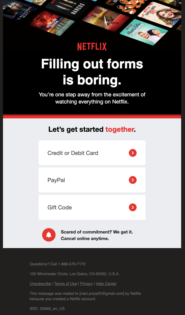
Did you know they have an abandoned cart email? You probably signed up for it as soon as you first heard about it. But I waited a while. I had started the signup process but then left at the last stage when it was time to pay. This is the email they sent 1 day after that.
Here's what I liked about it and you can also use as inspiration for your brand:
- Start with a statement that everyone will agree with. No one, in any age group likes to fill up forms.
- Encourage to complete the last step to watching everything on Netflix
- 'Let's get started together' feels like they will handhold as you complete the process so it's going to be very smooth.
- Address objections of people who might not want to commit for long by saying that it's easy to cancel anytime. They don't have to visit any store, they can cancel it online.
Conclusion
In this article we covered emails from DTC brands from various parts of the world. We broke down emails from Saas companies, OTT platforms, Insurance providers, education platforms, etc.
The one thing we see is that to create a good campaign, design, copy or product alone are not enough. Your emails need to be as professional as everything else about your marketing. Avoid grammar mistakes, know when to use the em dash, and add a pinch of colorful creativity to make your emails stand out. But, that’s not all there is to good email marketing. You need all these and understanding of your customers persona to create an effective email that can persuade people to take action.
The 20 examples we shared above might not fit your brand directly but they can provide inspiration and understanding of basic principles of social proof, learning with benefits, imagery that people can relate to etc.
If you have a campaign in mind but are looking for the right email marketing software to execute it, you should check out SendX. It's intuitive, affordable and easy to use so you spend more time on your campaign ideas rather than dealing with email marketing software.
It's free to try for 14-day and you don't even need a credit card to sign up. 3000+ companies use it for their email marketing. But don't take our word for it, give it a try yourself.


