
Email Marketing Infographic Best Practices for 2024
For your email marketing campaign, an infographic can be one of the best additions to boosting its effectiveness by manifold. Did you ever try to utilize infographics in an email marketing newsletter before? If you didn't, then we have news for you to shock you right here.
Do you know our human brain is attracted to visual things more than anything? Based on research 93% of all our conversation is nonverbal. If you use images in your content then you will get at least 94% more views. Besides, take a look at social media, almost all contents are visual there.
Just ask yourself a simple question, whenever you see a wall of text without any image at all, do you like it? Or when you see so many illustrations with visual contents like images & videos, isn’t it even better?
We know, the answer is the 2nd one.
So the same thing applies to your audiences as well. If you create an email newsletter with an infographic then it will increase your overall conversion rate. Besides, an average customer usually receives hundreds of promotional emails daily, if you cannot make your email newsletter attractive then it won't be able to stand above the crowd.
Okay, let’s get to business. In this guide, we will explain to you a couple of important things in detail. What is an infographic? Why is it vital for your email newsletter? How can you create an infographic by yourself using free & paid tools? And some cool examples to inspire you.
Table of Contents
What is an Infographic?
Infographics is a collection of images, charts & some text to illustrate a message. You may write a 1,000 word article, however if you use an infographic it can represent the same amount of information in a quick & interesting way.
Most of the time we do not like to read the whole text of an article, instead, we are looking for videos. Do you know why? It's mainly because we do want to use minimal efforts of our brain to extract the information from the text. We always want to find an easier way to do it.
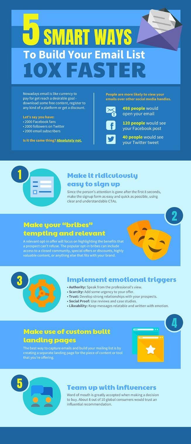
Just take a look at the above Infographic example. “5 smart ways to build your email list 10X faster”. You have to write at least 2,000+ words articles just to illustrate the same amount of information this infographic covers.
There is another reason behind it, in an infographic you can input a chunk of information without giving any introduction. But in an article, you have to give an introduction to begin.
One more thing – do you know that around 80% of your audiences never read past the headlines of your article? Yes, these 80% simply read your article headline then leave. Only the remaining 20% feel interested enough to read the article. However, even these 20% usually do not read text line by line, they just skim your article for bullet points, headlines & images to extract information.
By now you would have realized that our human brains are not designed to read the text, and instead they are attracted to colorful visual things, and that's why you need to use an infographic to catch your audience's attention.
So, let me recap here, why do you need to use Infographic?
- Easily explain complex information.
- Visual content can be easily digested by your audience.
- Display statistical data in shortcuts without saying a lot of words.
- Attracts 100% of your audience as their eyes are always looking for visual things.
- Receive millions of shares in social media.
How to Use an Infographic in Your Email Marketing Campaign
We guess you are not among the 80% of the audience who never read past the headlines, otherwise you wouldn't be here to read this text. So, congratulations to you. Now we are going to show you how to utilize infographics in your email newsletter.
Step 1: Craft an eye-catching subject to increase open-rate
What is the point of doing all of this infographic magic if no one even sees it? If your email open rate is very low then nothing will work. Thus, you have to begin with a powerful eye-catching subject line to attract most of your audiences.
Here are some creative subject lines for you to try:
- Apply these [6] secrets technique to improve [email marketing]
- Don’t believe these [6] oldest myth of [email marketing]
- Don’t waste time! Learn these [6] facts of [email marketing]
- Stop! Before you leave, just read these [6] facts of [email marketing]
- The Next [6] techniques will change your mind completely about [email marketing]

These are just samples to make you understand how to write an attractive subject line to draw your audience's attention. We encourage you to use your creative ideas. You may use this "headline analyzer tool”. It is free & has a Google Chrome extension. Just type your subject line & see how engaging it is.
Step 2: Keep it simple yet smart & engaging
Always remember this – do not ever overwhelm your audience with too much information. Always try to make it as simple as possible so they can digest it easily. In your email newsletter try to provide interesting & eye-catching visual elements to increase its click-through rate.
How to do it? Okay, you need to see some examples.
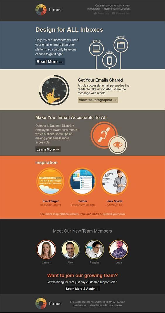
Take a look here. A very simple yet engaging infographic that encourages your audience to click to find out more.
Here is another one for you.

Without saying much you can easily explain to your employees how they can work at home & how to adjust to the new reality.
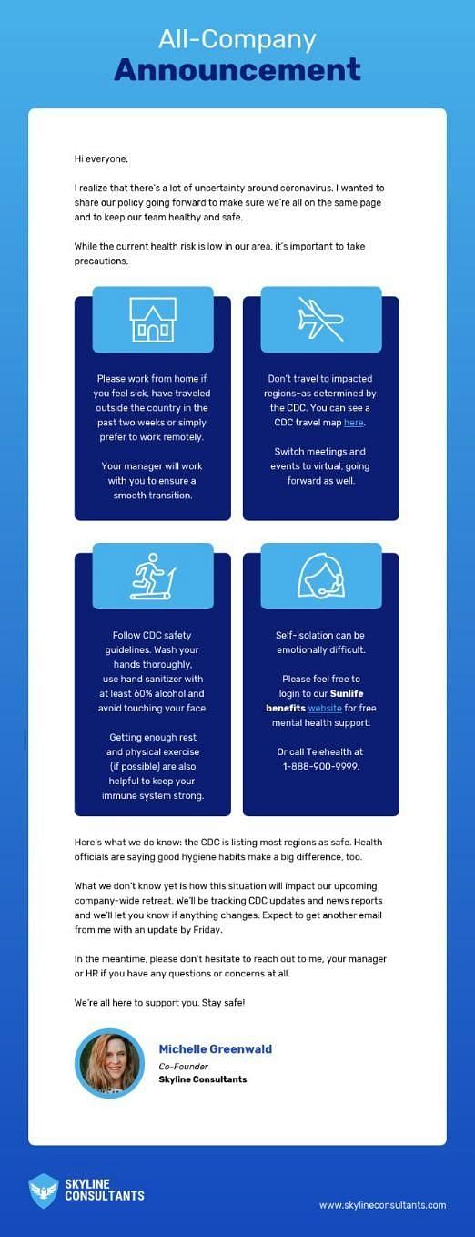
Finally, take a look at this infographic newsletter from a company. They are helping people to give some vital information regarding coronavirus safety.
Step 3: Use the A/B testing feature to find out the sweet spot
Even with all of these techniques and strategies you may not get the appropriate result. Do you know why? It's because you didn't customize your email campaign based on your audience's likings.
To do that, you must have to test your emails in different segments to understand which one is performing best. A/B testing or split testing is a perfect solution for that purpose.
We suggest you read this guide "Email A/B Testing Explained with Examples, Ideas, and Tips” to learn more about it.
Step 4: Smart landing page to convert your visitors
A landing page is the last stage of your marketing email campaign. If it is not properly optimized for targeted visitors then all of your efforts will go in vain. So, your target is to make the landing page as attractive, informative & reliable as possible.
Also keep in mind that personalized marketing can be one of the best ways to convert your visitors.

Just take a look at the above landing page. Instead of a common landing page, they have personalized it with a specific audience name. When you mention a person's name within your email, message, or landing page it will help you to get closer to them & emotionally engage with them. It is by far the smartest tactics ever recognized.
How to Create a Simple Infographic Using Free Tools?
Now let's come to the real business. As of now, we have talked about the importance of infographics in your email marketing campaign. But, how are you supposed to create one? Well, there are so many options for you. The most painless option is a paid plan. You can invest around $100-$500 per infographic based on complexity. Or, you may want to create by yourself.
Here are top 7 infographic tools you may use to create one:
There are lots of tools & you don’t have any idea where to start? No worries, we will show you the way & you don’t need to have advanced knowledge of Photoshop or illustrator.
Okay, let's get started & make your very own infographic in 2 simple steps using Canva.
Step 1: Select pre-designed infographic templates
Canva has both free & paid options, but for a simple & basic infographic, you can do it with a free plan. First, register a free account. You can even do it with the Google login option if you want.
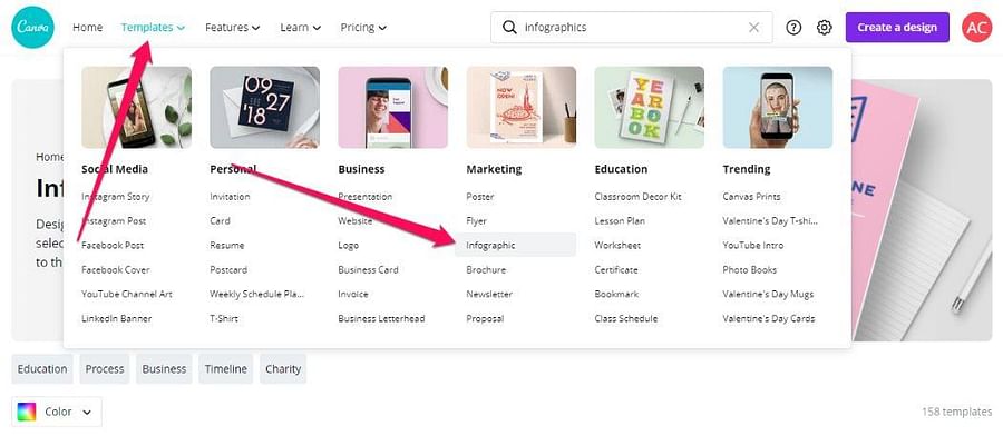
After that hover your mouse on the template section then select the infographic option.
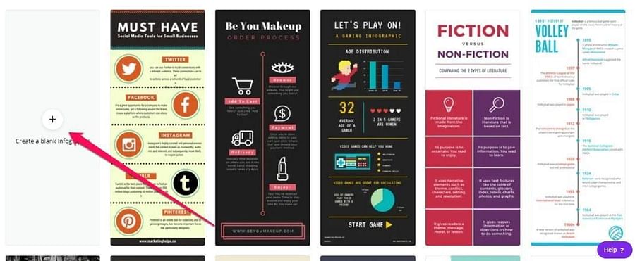
Here you will find lots of premade templates. You can also create an infographic from scratch. To do that click on the “create a blank infographic” option. It will open a new window with a blank page.
However, my suggestion is - don’t go for that option unless you have previous experience in design. Instead, browse the premade templates & select one that is close to your imagination.
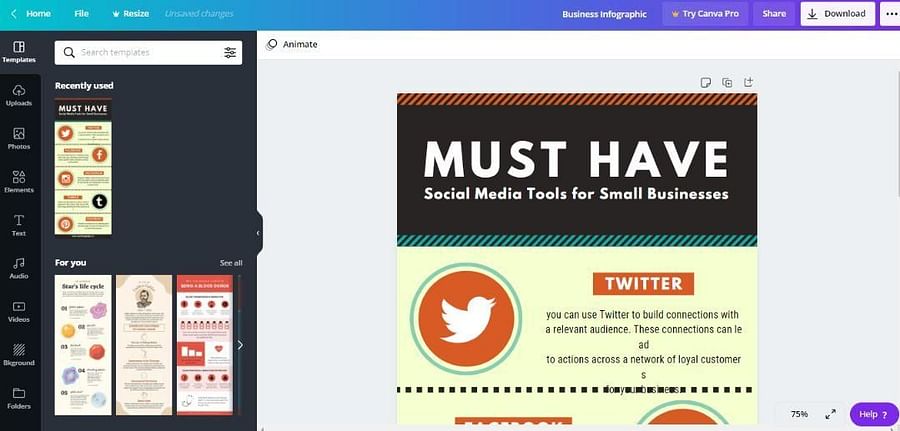
Let's say you want to create a social media-related infographic. So, for that purpose, we have selected this one. You can edit or remove any elements from this premade infographic. So, don't worry about it.
Step 2: Edit the premade infographic to make it yours
Just edit some text according to your topic then click on the download button. That’s it. Your own branded infographic is ready to publish.
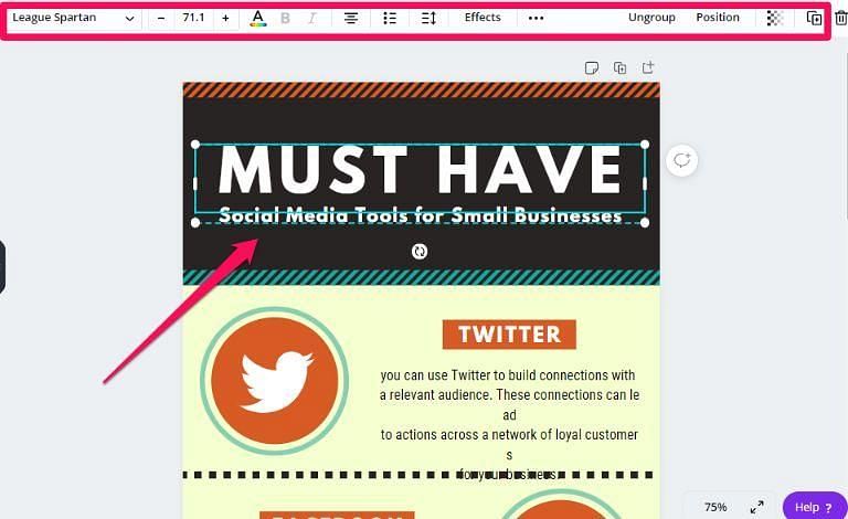
But, if you want to learn some advanced editing then take a look at the left side options.
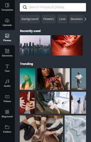
Templates: This option allows you to choose a new premade infographic. If you do not like the current template then select this option to find a new one.
Uploads: By using this option you can add custom images, audio, or video to add in your infographic.
Photos: Do not like the premade infographic images? Or, you may want to add something different. In that case, select this option to add different images to your infographic.
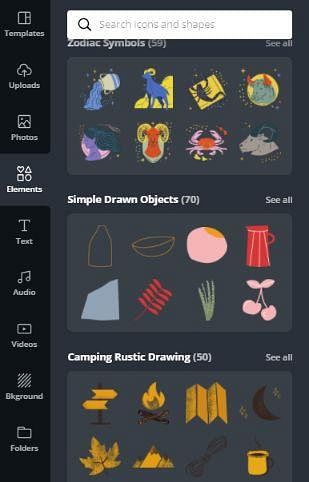
Elements: Almost all types of icons are here. From social media icons (Facebook, Twitter, Pinterest, Instagram, etc.), arrows, circles, stickers, charts, grids, etc.
Text: Here you can change text colors, design, formats almost everything.
Note: You may find some images are premium which means you cannot use them in a free plan. They might ask you to purchase for only $1. My advice is - In that case do not purchase those images instead purchase the paid plan. As you will get all of the premium images for free in the paid plan.
Finally, don't forget to download your newly created infographic. In the download option, you will find jpg, png, pdf options available.
Conclusion
Email marketing is a powerful & very effective method to drive targeted traffic to your site. However, if you have some prior experience in email marketing then you are painfully aware of its downside. It has a very low open rate, click-through rate & finally conversion rate.
Though, all of these drawbacks can be fixed with the tricks & tips we have shown you in this guide.
To fix the low opening rate: craft an eye-catching subject line.
To increase click-through rate: use visual contents like an infographic in a smart way.
Finally, to increase your overall conversion rate use an equally engaging, informative & personalized landing page with enough content to convert them right away.
If you have not used these tactics before then it may take some time to get the results. Be penitent & use the A/B testing method to identify which type of content is best suited for your audience.
To put into action the knowledge you have gained from this article, and get the best results, you might want to try an email marketing software like SendX, which comes with a 14-day trial, no credit card required.
FAQs
1) What is an Infographic?
Infographics is a collection of images, charts & some text to illustrate a message. In an infographic you can input a chunk of information without giving any introduction.
2) Why do I need to use an Infographic?
Using an infographic, you can easily explain complex information. And besides, visual content is easily digested by your audience. You have the added benefit of displaying statistical data in shortcuts without saying lots of words.
3) How can I increase the click-through rate using an Infographic in my email?
By using visual contents like an infographic in a smart way, you can increase the click-through rate. For example, In your email newsletter, you can provide interesting & eye-catching visual elements.
4) Can you suggest some tools using which we can create infographics to include in our email campaigns?
There are many infographic tools out there. Here we would suggest the following: Canva, Piktochart, Venngage, Visme, Infogram, Snappa, and Picmonkey.


