Invitation Email Examples That Get People Excited To Attend Your Event
If there's one thing that gives marketers the most stress on an event prep to-do list, it's the event invitation emails. These emails introduce the event that takes weeks or months to plan out & if written poorly, will lead to poor return on investment and efforts.
Moreover, the audiences' calendar space and inboxes are filled with an ever-growing number of virtual events. So you need to stand out with your invite, Whether you’re hosting a virtual or in-person event.
How do you craft an event invitation email that would get people excited to participate? And even invite their friends and family!
If you want to maximize the number of RSVPs to your event, create a buzz about it in your community, and mark it a success, then this guide is for you. We will talk in detail about 4 elements that are staples to an event invitation email, 20 event invitation email examples, and a few ingenuous tips.
Table of Contents
4 Main Elements to Include in your Email Invitation Template
Subject line
The subject line is the reason your subscribers will open or not open your email. The purpose of subject lines is not to tell the whole story but to get someone to think, 'oh, I would love to know more… What is it about?'
There are hundreds of resources online on how to write catchy subject lines. We also have ready-to-use subject lines specifically for event emails at the end of this post.
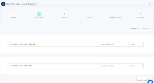
But the best way to judge what kind of subject lines work for your audience is to test variations of subject lines and find out the type that gets the most open rates. You can test out the effect of emojis, personalization, shorter vs. longer subject lines, etc.
If you use a tool like SendX, you can do that easily without learning to code or any complex process. For a detailed guide on how to do A/B testing on the subject line, checkout this short guide later.
Basic details
These are a must include in your invitation email —
- Name of the event
- Date & Time
- Duration of the event
- Location (Whether it's virtual or real)
Reasons to attend the event
Give people compelling reasons why they should attend this event. You can also talk about the insights or free bonuses they would miss if they didn't attend the event. You can talk about the benefits they can get only if they attend the event and not otherwise, e.g., live Q&A with speakers.
The process of booking a spot
Once you've convinced people to attend your event, let them know clearly how to register/RSVP/book a spot. Explain the process in your email or lead them to a landing page where they can get the details. Make your CTA clear and actionable. If they need to buy tickets, say, 'Buy a ticket here,' or if it's a free event, you can say, 'Book your spot for free.' Make your CTA contextual to the event.
You can also use this space to inform readers if they should bring something special to the event for note-taking or taking part in activities. Further, you should add a signature to an email. Making an ornate and memorable one is easy by using email signature generators. Consider creating and adding a digital business card to your signature. This gives people a chance to save essential information instantly.
Attractive design
Once all the above details are clear, then you can move on to putting them in a visually attractive package — your email design. Make sure your design is mobile-friendly, on-brand and makes the information easy to read. Bonus points if you use interactive elements like digital brochures or guides! These are great if for example you’re doing events in Auckland or other beautiful cities. Interactive brochures allow you to show the tourist spots event-goers will want to visit during their stay.
In this post, we've collected 15 event invitation emails based on their design, content, how they are structured and what information they deliver to the reader. Most of the emails are for virtual events, but the same principles would apply to an in-person event. For each example, we will cover the takeaways and what we learned from it, so you get ideas to create your own event invitation email.
Event Invitation Email Examples You Can Learn From
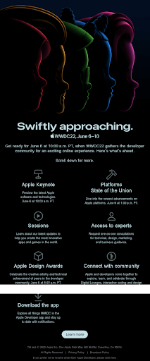
1. Apple's WWDC22 Invitation Email
What we liked about this:
- Event name and date are mentioned on top. It makes it clear what this email is about.
- Prompt to scroll down to get people to read the full contents of the email.
- Mix of one-column and two-column designs to organize information.
- CTA at the end to 'learn more.' This is more effective than 'Buy tickets' or 'Attend an event' as it simply invites to know more without any obligation.
- Dark background with light-colored text makes it easy to read even in dark-mode.
2. Demand Curve Growth Summit Invitation Email (Free tickets!)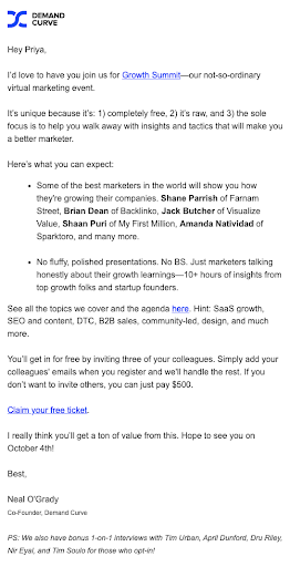
What we liked about this:
- This is an example of a plain-text email executed nicely. It is formatted with bold text, bullets, and varying sizes of paragraphs.
- Clearly outlines what attendees can expect from the event. Talks about why it's different from other events.
- PS at the end acts as a final note to nudge people to take action.
- Incentive to promote it amongst friends and colleagues is explained.
- Three different CTAs leading to the same page to improve conversions.
3. Salesforce In-person event invitation email
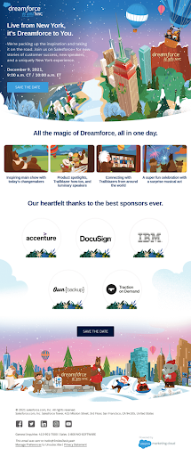
What we liked about this:
- Visually exciting email makes one want to know more about the event. It feels like a grand party rather than a boring corporate event.
- Theme of the event that is related to a particular city is evident from the images.
- Agenda for the event explained with text and images.
- Repeating CTAs — one on top and another one at the bottom — improve conversion.
- Date, time, and location are clearly mentioned.
4. Duolingo virtual conference invitation email
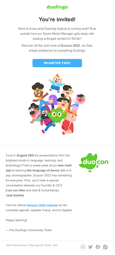
What we liked about this:
- The hook of the email is curiosity-based, asking a few questions to the recipient.
- The visual represents people from various ethnicities, thus promoting diversity.
- Email is kept short, and CTA is given to visit the website to know more about the event.
- The name of the event is related to the brand name. It makes it sound special and more than just a webinar.
- CTA 'Register Free' makes it clear that the event is free, so people don't have an objection to price.
- There's a mix of button and text CTA.
5. Google Cloud community event invitation email
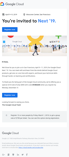
What we liked about this:
- The most important information – Date and location are mentioned on top.
- The headline is followed by the CTA so people who are already familiar with the event can register without having to go through the full email.
- Incentive to take action is provided by giving a discount coupon code.
- The end date to use the offer prompts urgency and improves the conversion rate.
6. Gurl Museum immersive experience invitation email

What we liked about this:
- The image of the artists coming to the event makes it more relatable and people who know the artists already would be interested to attend.
- Date and time are clearly mentioned in the top section.
- There's a subtle CTA to check out previous experiences so people can judge if it's for them or not.
- Discount is given to incentivize people to attend. The discount gets its own section making it hard to miss.
- There's one color theme, but contrast is created by using various shades of it.
- The footer has CTA to follow on social media. This gives the brand more touchpoints with the audience.
7. Kajabi Influencer Summit invitation emailWhat we liked about this:

- A bold headline makes people want to continue reading.
- The first section outlines what the event is about
- Authority and social proof are included by quoting Brendan's various achievements.
- It's written in a style as if Brendan is writing it himself and personally inviting you to the event.
- Use of emojis to make it relatable.
- Date, type of ticket (free), and name of the event are repeated at the end again along with the CTA to improve conversion.
8. Miro community event invitation email

What we liked about this:
- The reason why someone should attend this event is explained in the headline itself.
- Date and location of the event, i.e., virtually, are clear from the bright, bold text on top.
- 3 bullet points explaining more about the benefits of the event.
- Two CTAs with ample white space around them make them stand out and make it easy to click on mobile.
9. No Code Conf in-person event invitation email

What we liked about this:
- Invitation is in the headline with all the important information about the date and city.
- There's name-dropping of famous personalities, which brings credibility to the event.
- It's short and sweet, with only two small paras. So easy to skim through, even on mobile.
- The CTA is simply to see who's speaking and says nothing about buying a ticket or registering. This lowers the objections in people's minds to take the next action.
10. Scalable Live in-person event invitation email

What we liked about this:
- Image of a ticket with date and location adds a visual element while conveying the important information.
- Offer of an 80% discount incentivizes people to act soon. Talks about pricing going up to create a sense of urgency.
- The PS section explains about the event to anyone who's not aware. This helps convert even a cold audience into attendees.
- Text CTAs sprinkled throughout the email to improve conversions and not break the flow.
11. Semrush virtual event invitation email
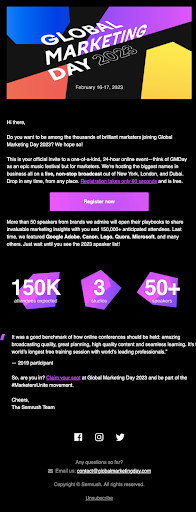
What we liked about this:
- Name of the event and dates are mentioned on top, so people don't forget to block their calendars.
- Uses bold, bright, and contrasting colors to draw attention.
- Social proof and credibility are shown with 3 key numbers related to the event – attendees, speaker, and studios.
- Mentions that registration is quick and easy, and it's free. This lowers the barriers to taking action for recipients.
12. Shein in-person invitation email

What we liked about this:
- Lots of different sections are segregated by using different shapes, boxes, and background colors.
- Promotes downloading the app to convert the audience into potential customers.
- CTA to shop at the end. In case someone is not interested in the event, it will at least drive them to the app to shop.
- Social media handles (take for eg. Twitter handle) at the end to connect outside of email and get maximum touchpoints with the audience.
How To Set Up An Event Invitation Email Campaign With SendX
Notifying your subscribers about your upcoming event with only one email is not enough, as not everyone will see the first email. Also, you need to create a reminder on the day when the event is supposed to happen.
So your invitation email campaign is a drip campaign that consists of more than one email that helps you:
- Announce your event
- Make sure maximum people know about it
- Send reminder emails
- Collect attendee list for segmentation later on
Let’s walk through the process in steps to create an email invitation campaign in SendX
Step 1: Import your contacts
Import contacts from a CSV file or paste the contacts into SendX.

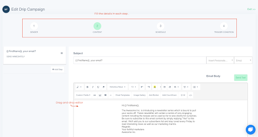
Step 2: Create a drip campaign
Go to Campaigns > Drip and start setting up your drip campaign
Step 3: Set up automation
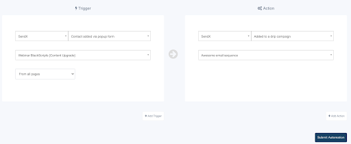
Go to automation and click on 'New automation' to set the emails to go out automatically based on certain conditions.

Choose the drip campaign you created in the previous step to be sent out to people who fulfill a condition, such as getting added to the event list.
Make your job easier: Get editable templates & subject lines
The inability to captivate an audience from the outset is one of the most frequent reasons events don't go smoothly. Poor attendance reflects poorly on your marketing strategy.
But as a marketer or brand owner, you already have hundreds of things to do. Going through the inspirations or ideas, we gave, testing them, and then revising them is not enough. So how do you create engaging invitation emails fast?
One thing you can do is download our collection of email invitation email templates with subject line ideas. These templates have been created by copywriters that are masters in their craft and would have otherwise cost you a few hundred $, but you can sign up for these templates here and get them for free.
FAQ's
1. How can I write a good invitation for an event?
You need to follow these best practices to create a good invitation for an event:
- Promote your event by sending engaging messages
- Send email messages to the attendees
- Send event schedules via email
- Create a personalized email experience
- Thank all the attendees
- Take follow up with those who missed the event
- Create a digital flyer with a great design.
2. How can I make my event invitation email more effective?
You can use an email automation tool to automate your email marketing. You can also use AI writing software, AI fact checker and AI image generator, that'll also help you personalize the content for each email and make it more interesting and that too within seconds.
3. What are the main elements to include in my event invitation email?
Here are 4 main elements to include in your event email invitation:
- Thorough details
- Catchy phrases
- Attractive design
- Catchy email subject lines.


