Guide to Understanding the Unsubscribe Link & Its Usefulness
Table of Contents
What Is An Unsubscribe Link?
An unsubscribe link is a link in your email that allows subscribers to take themselves off your emails list so they don't receive your emails anymore. It’s often placed in the footer of emails.
It allows recipients to opt out of future email communications from a sender. It's a regulatory requirement and a best practice for maintaining subscriber consent and engagement. Including an easily accessible Unsubscribe link helps maintain compliance and fosters positive sender-recipient relationships.
On clicking this email, the subscriber is usually taken to a confirmation page, confirming that they have unsubscribed successfully. This is called a one-click unsubscription. Or they can be taken to a page where you ask them the reason for unsubscribing and then confirm the unsubscription. Keep the form short and process easy so that the user experience is not hampered.
The % of people who unsubscribe from your list is called Unsubscribe rate.
Unsubscribe rate = (Total number of Unsubscribes / Total number of delivered emails) x 100
Why Should Marketing Emails Have An Unsubscribe Link?
It's required by the law
Digital laws might differ from country to country but almost every country states that you must have an unsubscribe link in your email.
The most popularly referenced law is -- US’s CAN-SPAM (Controlling the Assault of Non-Solicited Pornography And Marketing) legislation enforced by the Federal Trade Commission. It states that you must include a clear and obvious way for subscribers to opt-out of your commercial messages:
Tell recipients how to opt out of receiving future emails from you. Your message must include a clear and conspicuous explanation of how the recipient can opt out of getting emails from you in the future. Craft the notice in a way that’s easy for an ordinary person to recognize, read, and understand. Creative use of type size, color, and location can improve clarity. Give a return email address or another easy Internet-based way to allow people to communicate their choice to you. You may create a menu to allow a recipient to opt-out of certain types of messages, but you must include the option to stop all commercial messages from you. Make sure your spam filter doesn’t block these opt-out requests.
In May 2018, GDPR became a compulsory rule for any brand with subscribers in the EU.
According to article 17 of GDPR, ‘Right to erasure’, data subjects (subscribers) have the right to ask their data to be deleted. In that case, data controllers have to comply with it. They have to delete any data when it’s no longer required for the purposes for which it was collected, or the data holder/subjects withdraw consent for it to be used.
If a contact unsubscribes from an email list, they are exercising their 'Right to erasure' and the data controller (the owner of the email list) has to unsubscribe them and delete their data.
Non-compliance with GDPR can lead to a fine amounting to €20 million or 4% of annual global turnover, whichever is higher.
It helps keep your senders' reputation and thus deliverability high
Not everyone would stay a fan of your emails forever. Once their requirement is fulfilled or changed, people would like to keep their inbox clean and unsubscribe from emails.
In that case, if you don't provide an easy, clear, and quick way to unsubscribe, people will go for the easiest solution to avoid getting your emails -- hit the spam button! And move you to the spam folder, forever. That's the worst-case scenario.
In a less scary situation, they will just stop opening and engaging with your emails.
Both these situations will signal the inbox service providers (Gmail, Yahoo, etc.) that the emails you are sending are not valuable to the receivers. It's a negative signal from the sender i.e. you. It will reduce your senders' reputation that has a direct impact on your deliverability (the % of emails that go into inbox vs spam folder). A bad senders' reputation will lead to lower deliverability.
Even the emails for people who want to receive those might go into the spam folder. This will reduce engagement and ROI on your email marketing efforts.
So the best way is to let people unsubscribe by themselves in a clear, quick and easy way.
It keeps your list clean
If people who don't want to stay on your email list can't unsubscribe, they will simply stop engaging with your list. This will lead to poor engagement metrics, and your reporting dashboards won't give you a clear picture of whether your email strategy is working or not.
It will keep your list size bloated, but that doesn't mean it will also drive revenue. More contacts who don't want to engage with your business are in fact costing you in terms of ESP cost.
So it's better to let people go themselves so your list stays clean.
How To Add Unsubscribe Link In Emails Sent From SendX
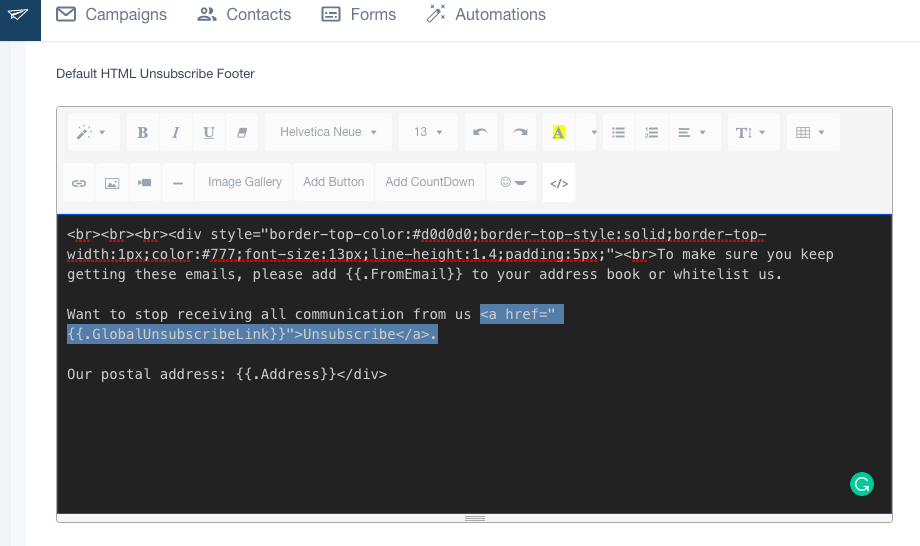
Customizing your unsubscribe link in SendX is a simple 3-step process.
1. Log in to your account. Click on the profile and go to 'Settings'
2. Click on 'Account Preferences
3. Scroll down to find 'Default HTML Unsubscribe Footer'
This is the footer that will be placed in all your email campaigns, by default. You can customize it to suit your brand language/tone etc.
4. Click on the '</>' icon to see the HTML code behind it.You'll see that the link for unsubscribe is -- <a href="">Unsubscribe</a>
Examples of Good Unsubscribe Links in Email Campaigns
Deciding on the design and copy of an unsubscribe link in your emails is a one-time task. You can then use the same format in any kind of email you send. Let's look at some of the examples from top brands for inspiration on how to show an unsubscribe link.
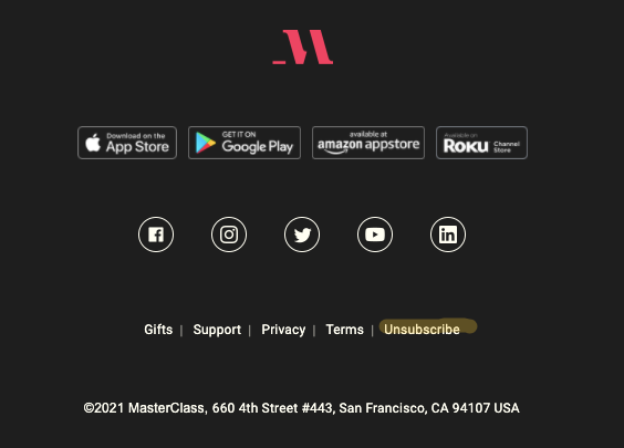
Masterclass
There's ample white (or black in this case) around the Unsubscribe link to make it stand out. It's placed at the end of the row which makes it easy to find.
Airbnb
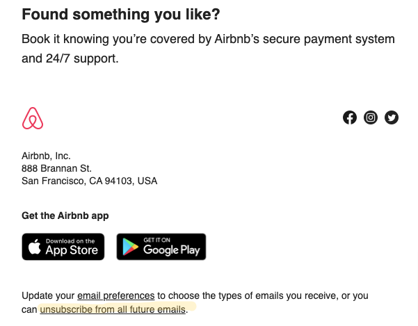
Instead of saying just 'unsubscribe', it also states what you are unsubscribing from i.e. all future emails. Makes things a lot more clearer.
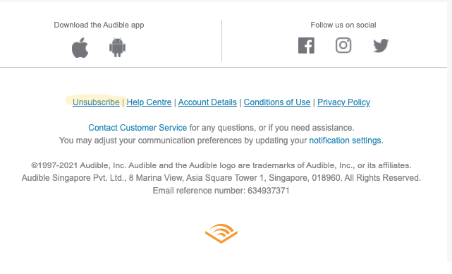
Audible
This is the first link in the footer. It shows that the brand is confident in letting people go if they wish to. Builds trust in the brand.
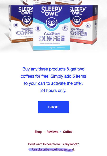
Sleepy Owl
This brand makes you comfortable even if you are unsubscribing from their emails with the conversational sentence 'We'll understand'.
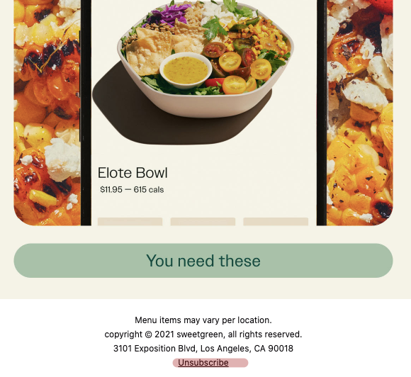
Sweetgreens
Placed at the bottom in a separate link from other text to make it stand out. It's clear, crisp, and easy to spot.
Wrap Up
Now that you know it is super important but also super easy to implement unsubscribe link in your emails, it's time to audit your campaign and fix if your unsubscribe link is not visible properly, not obvious, or not working.
It's not part of your content but an overhead task required to keep the list manageable. For such things, it's always easier if you use tools that help make your job easier. One such tool is SendX - an intuitive, affordable email marketing software. It's free to try for 14 days. You don't even need any credit card to signup and you can test all the features and even quick customer support. Learn more about it here.


